March 23, 2026
4 min read
How OKLCH Makes Better Gradients (And Why We Built Our Tool Around It)
Blue Monkey Makes
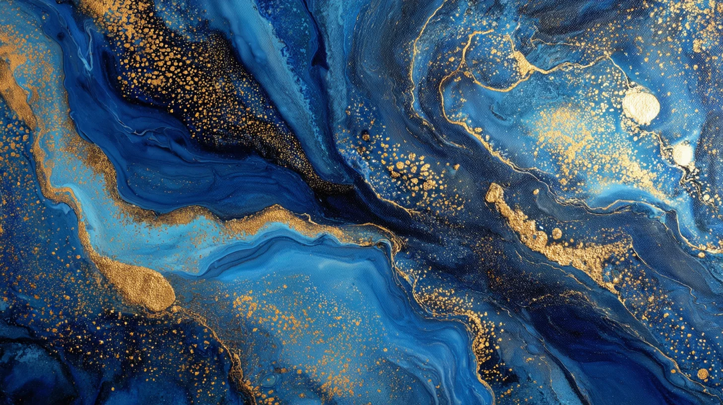
If you've ever created a gradient from blue to yellow and wondered why the middle looks like dishwater, you've run into the RGB interpolation problem. It's not a bug in your code. It's a limitation of the color space.
Most gradient tools — and CSS itself, by default — interpolate colors in sRGB. This is the color space your monitor uses, and it's fine for displaying individual colors. But it's terrible for blending between them, because sRGB isn't perceptually uniform. Equal mathematical steps don't produce equal visual steps.
This is the problem OKLCH solves. And it's why we built our gradient tool around it.
What "perceptually uniform" actually means
In sRGB, equal numerical steps don't produce equal visual steps. The perceptual difference between two colors that are 20 units apart in RGB depends entirely on where in the range they sit. The scale isn't linear in terms of how your eyes process it — and when you interpolate a gradient across that nonlinear scale, the midpoints suffer.
OKLCH (Oklab Lightness, Chroma, Hue) is designed so that equal numerical changes produce equal visual changes. A 10-unit shift in lightness looks like the same amount of change whether you're at the dark end or the light end of the scale.
This has three practical consequences for gradients:
- No muddy midpoints. A gradient from blue to yellow stays vibrant throughout the transition instead of passing through gray.
- Predictable shade scales. When you generate shades from 50 (near-white) to 950 (near-black), each step looks evenly spaced.
- Harmonious color relationships. Rotating hue by 120 degrees in OKLCH produces a visually balanced triadic palette. The same rotation in HSL produces colors that feel unbalanced because HSL's hue wheel isn't perceptually even.
How we use OKLCH in Gradient Galore
Every color operation in Gradient Galore happens in OKLCH space. Here's what that looks like in practice.
Shade scale generation
When you pick a base color, we convert it to OKLCH, then generate 11 shades by setting the lightness to predetermined targets (0.97 for shade 50 down to 0.14 for shade 950). We scale chroma proportionally — colors near the extremes get less chroma to avoid oversaturation at the edges.
The result is a shade scale that feels natural. The 500 shade is the "true" color. Lighter shades are tints. Darker shades are shades. And each step is visually equidistant.
True tints, shades, and tones
Most tools generate a single lightness ramp and call it a "shade scale." We generate three separate scales:
- Tints: Base toward white — lightness increases, chroma decreases
- Shades: Base toward black — lightness decreases, chroma slightly decreases
- Tones: Base toward gray — chroma decreases, lightness stays near the original
These are the classical color theory definitions, computed accurately in OKLCH.
Color harmony
When you generate a complementary, analogous, or triadic palette, we rotate the hue in OKLCH space. A complementary color is +180 degrees. Analogous colors are +30 and -30 degrees. Triadic colors are +120 and +240 degrees.
Because OKLCH's hue dimension is perceptually uniform, these rotations produce harmonies that actually look harmonious — unlike HSL, where a 120-degree rotation might produce two colors that feel like they belong together and one that doesn't.
Palette-wide adjustments
The palette editor includes global sliders for hue shift, saturation scale, and lightness scale. These operate on the OKLCH values directly:
- Hue shift rotates all colors by the same number of degrees
- Saturation scale multiplies chroma by a factor
- Lightness scale multiplies lightness by a factor
Because these operations happen in a perceptually uniform space, the adjustments feel proportional. Shifting hue by 30 degrees moves every color by what looks like the same amount.
Contrast checking
The contrast checker uses relative luminance (WCAG 2.x formula) to compute ratios between any two palette colors. This part doesn't use OKLCH — WCAG is defined in terms of sRGB luminance — but the underlying conversion from hex to linear RGB reuses the same sRGB-to-linear function that feeds into our OKLCH pipeline.
CSS now supports OKLCH natively
CSS now supports OKLCH natively. You can write:
background: linear-gradient(in oklch, #6d28d9, #0891b2);
And the browser will interpolate in OKLCH space, avoiding the muddy midpoint problem. This is a meaningful improvement over the default sRGB interpolation.
However, CSS color interpolation only helps with simple gradients. For aura gradients (layered radial blobs), mesh gradients, and shade scale generation, you still need to do the math yourself. That's what Gradient Galore does — and why the OKLCH engine is the core of the tool, not just a nice-to-have.
Try it yourself
If you want to see the difference OKLCH makes, open Gradient Galore and create a gradient from a warm color to a cool one. Compare it to the same gradient in any tool that uses RGB interpolation. The midpoint tells the whole story.
We built this because we wanted better gradients in our own projects. The color science made it possible. The tool makes it practical.